


How McLaren and OKX won in Monaco (also) through Creative Direction
While Lando took pole and the win on track, McLaren and OKX had already conquered Monaco through visual storytelling. I spoke with creative director Mynxii White to uncover how it all came together.

The heat has arrived in Milan, marking the worst time of year for me. I'm a rare Spaniard — I much prefer the cold to the heat, or at the very least, I only enjoy the sun when I'm not stuck with my work laptop and there's a beach or pool nearby. Sadly, that will have to wait until August (send help).
Monza is one of the few places where I can actually stand the heat. I'll be attending the Sunday race there, hoping the sun won't be as brutal as last year when it took just minutes to get sunburnt and end up the same shade of red as a Ferrari if you weren't careful. As well as Monza, I've decided to venture outside Europe this year, so I skipped Imola (as I went there last year) and opted for the night race in Qatar at the end of November.
Since I've locked in these two races, I've been working behind the scenes to hopefully build something extra around those weekends — and who knows, maybe even add more stops to the list. One I would've loved to include was Monaco, because as you know, I love a Grand Prix that's packed with fashion and brand activations — but that will have to wait for 2026.
Anyway, it's been a long week and I'm still reflecting on what happened in Monte Carlo. The Monaco Grand Prix was celebrating its 75th anniversary, having been on the Formula 1 calendar since day one, and for the first time ever, it had a title sponsor with TAG Heuer. We witnessed some major advertising and activation moments as well: Leclerc launched his first capsule collection with Ferrari for his home race, and the F1 film had its exclusive premiere for drivers and team principals, among others.
As we all know, Monaco is renowned for its exclusivity and glamour, making it the ideal backdrop for campaigns that feel, sound, or convert differently — within a unique F1 context that, in Monte Carlo’s case, extends far beyond the sport’s usual audience, reaching even those who aren’t Formula 1 fans. McLaren understood this opportunity and prepared something extraordinary as a chance to celebrate their heritage whilst engaging fans in a fresh way, but also to capitalise on the momentum the team is experiencing both on and off the track.
The perfect partner for this activation was OKX, a leading global crypto exchange and McLaren's Official Primary Partner — and the timing couldn't have been better for the brand, as it coincided with OKX's launch in the European market earlier this year, offering the perfect way to connect past and future as a marketing concept.
The centrepiece of the project was the unveiling of a special livery designed for the MCL39 cars of both drivers to be used at the Monaco and Barcelona Grand Prix. Here lies today's main point that I've been wanting to discuss: how exceptionally well McLaren communicates and integrates its partners in a way that is seamless, elevating both brands whilst engaging audiences.
Throughout the long F1 season, we see numerous livery launches — from the long-awaited Ferraris to the playful concepts on VCARB, that managed to do something similar with their pink summer edition in Miami, creating a movement particularly within Gen Z, the age group towards which they're focusing all their communications. However, apart from McLaren and (some of the) VCARB, we rarely see exceptional livery launches. With Ferrari, the hype is so enormous that when they finally launch the project, it always seems somewhat anticlimactic to me, as it did in Miami or with Leclerc's special suit edition in Monaco — the same applies to many other teams.
I truly believe this is because they put all the attention on the livery itself, rather than on a storytelling concept supported by art direction lines that transform it from just a livery into a bigger project where the car and suits become integrated elements. Just like McLaren achieved.
Stay until the end, because I managed to chat with Mynxii White about all the behind-the-scenes details of the creative concept that guided the project, particularly the launch video. But first, let me break down everything that made this activation one of the best livery launches executed, showcasing how crucial it is to pay attention to visual communication.
The Concept: French Riviera, reframed
Who would have thought the French Riviera could provide the perfect concept for a crypto company? Well, let me tell you, the best creative direction concepts are the ones you never expect to work together — the ones that create a bit of confusion (or even initial dislike; I quote Miuccia Prada in fashion: "If nobody hates it, it's probably useless"). But in this case, I don't think there was much room for hatred.
The creative direction revolved around French Riviera influences, but rather than doing something expected to express it — like depicting Monaco's iconic landmarks — they simply took the concept of Riviera elegance and combined it with McLaren's own legacy and OKX's core values. How? By using the "old money" aesthetic. The phrase "Old Money. New Money." served as the campaign's strapline, framing the entire visual style. Culturally, "old money" evokes classic European wealth and style, something Monaco's legacy (grand hotels, vintage race cars, aristocratic spectators in the 1960s) perfectly embodies. They also casually tapped into a very recent trend in fashion that resonated strongly on social media.
In essence, the artistic direction was about honouring the culture and style of Monaco's golden age of racing whilst celebrating new technology and ideas that are transforming both the sport and finance.

The Execution
To bring these two concepts to life, McLaren and OKX mixed the digital with the physical, again referencing the team's heritage alongside the innovation of their crypto partner, launching not only a livery but executing a comprehensive 360-degree activation:
1. The Livery
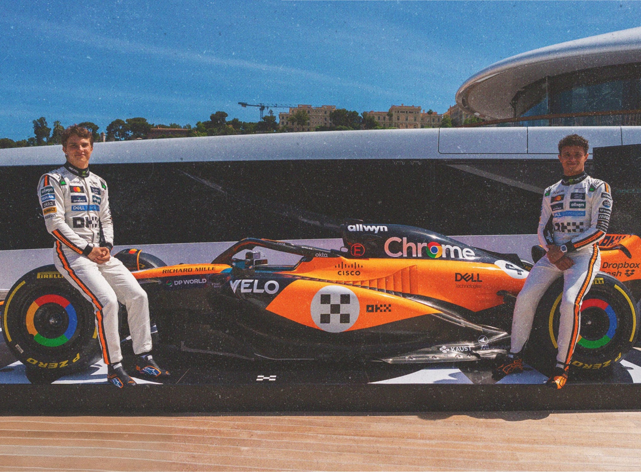
Although it might seem they didn't change much, it's all in the details. The vintage aesthetic took inspiration from McLaren's own French Riviera moments, bringing back to life Bruce McLaren and Denny Hulme racing at Monaco and other European circuits in the late '60s. The classic white race numbers, cursive name fonts, and retro colour palette on both the car and suits were chosen to evoke that 1960s era of Formula 1, when racing was as much a gentleman's sport as a technological pursuit.
This livery also served as a commemoration of Bruce McLaren (who passed away in 1970), with the M7A livery design reflecting respect for tradition and legacy. Additionally, OKX's corporate colours (black-and-white, with a modern checkerboard-esque logo) were woven into the livery without clashing, maintaining the sophisticated Riviera aesthetic.
The result was a seamless blending of eras: the car looked perfectly at home on Monaco's historic streets, yet the message was decidedly future-focused. Once on track, the OKX-branded "Riviera" livery naturally became highly visible on race broadcasts and news coverage, which also translated into enormous additional value when Lando Norris dominated the entire weekend, securing both pole position and victory in Monaco.
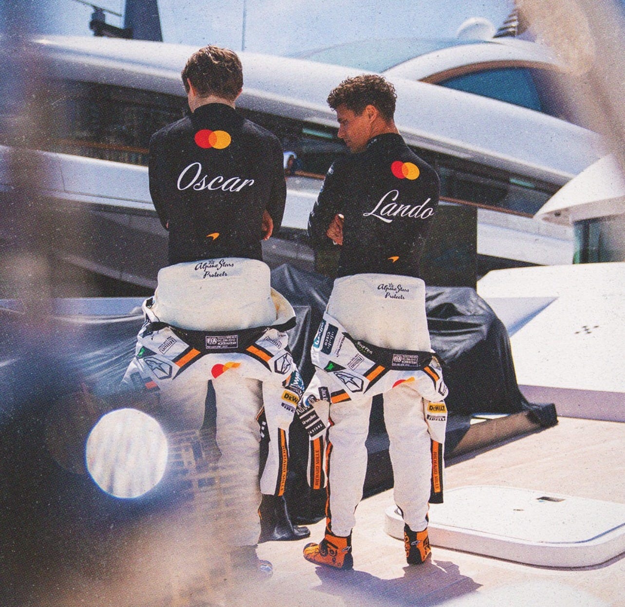
2. The Suits
Apart from being the best ambassadors of any McLaren project, Lando and Oscar were given fresh, white new suits that again matched the Riviera colour palette with a classic touch on the back names, rendered in an elegant serif font. You can see how the colours that form part of the suit as details on the sides became inspiration for social media colour schemes. Oscar even sported an M7A-inspired helmet design, whilst McLaren's media channels featured behind-the-scenes content using the hashtag #M7AReborn, with narratives that reinforced the activation's message and gave fans insight into the creative process, deepening engagement.

3. The Visual Identity
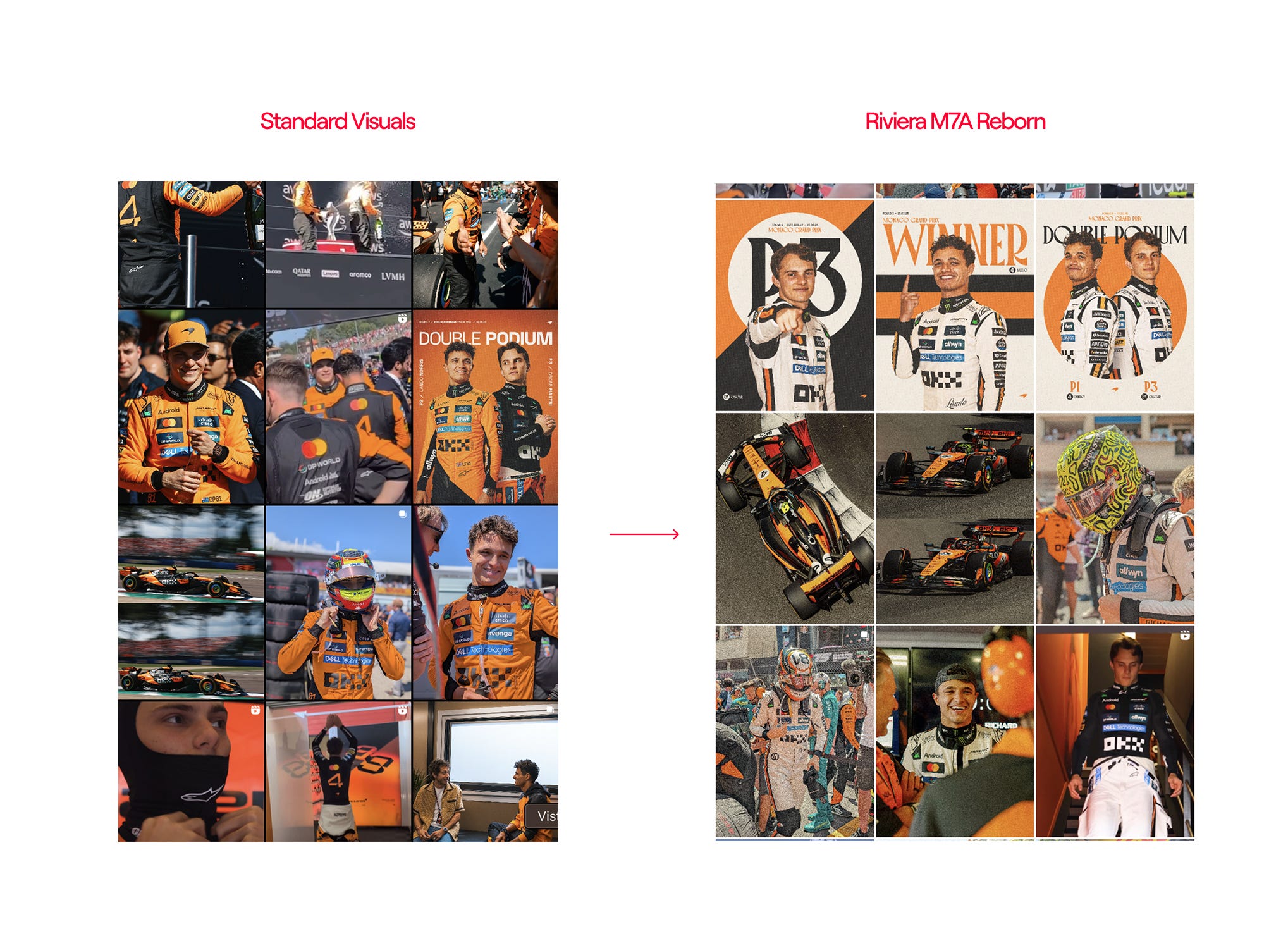
One of the most fascinating aspects is how this concept was applied across all McLaren media touchpoints, with social media post graphics adapted to match the theme and continue the visual storytelling even when communicating through social channels. All photography was adapted in terms of colour grading, applying a vintage treatment with very low contrast, whilst we also saw how they switched solid colours, mixing low-saturated black and papaya orange with cream white.
In terms of typefaces, they matched the vintage vibes by switching to a serif font and adding circular frames in most race result posts to complement the livery. As they usually do, they also applied this aesthetic to their social media profile logos. This demonstrates consistency and exemplifies how less is more — play with fonts, three colours, and a simple shape, and you can establish a strong identity.
All of McLaren's imagery across its digital touchpoints was adapted through colour grading. Photoshoots and videos placed the McLaren against Mediterranean vistas and villa architecture to evoke the 'La Dolce Vita' lifestyle associated with Monaco. The team created the hashtag #M7AReborn for social media posts to emphasise that this project brings a piece of F1 history (the M7A) back to life in the present day.

The High-Profile Unveiling Event
To complete the fusion of digital versus physical, old versus new, what could be more appropriate than a yacht in Monaco's Port Hercule harbour? This glamorous setting was where McLaren and OKX chose to unveil the "Riviera" livery to VIPs and media. In the days leading up to the race, the MCL39 was unveiled on deck, with McLaren teasing on social media that it was “living the yacht life”. This exclusive event emphasised the luxury theme, generated excitement among attendees and online audiences, and guaranteed that the partnership would receive more attention than a simple press release could ever achieve.
The Short Film
Alongside the physical unveiling, McLaren and OKX released an official campaign film featuring Norris and Piastri in Monaco, which was distributed across YouTube and social media touchpoints with short teaser clips. This coordinated release ensured fans globally, not just those at the track, felt part of the reveal. The YouTube short film received 249,000 views in just three days, which prompted me to investigate further when its creative director, Mynxii White, commented on one of my posts.
Behind the Scenes: A Conversation with Mynxii White
Mynxii White is a filmmaker and creative director known for her psychologically rich, visually striking campaigns for global luxury brands. She most recently directed the OKX × McLaren Monaco campaign, blending cinematic storytelling with precision and atmosphere. So who better to share an inside look at how the project came to life, from concept to execution.
A: What was the starting point of the creative direction for the “Old Money vs New Money” narrative together with the 1968 M7A inspiration?
MW: The concept began with a conversation around legacy, specifically how the M7A marked McLaren's arrival in Formula 1 as a serious contender. We wanted to echo that same disruptive spirit, pairing it with OKX's ethos as a challenger brand in a legacy-dominated space. “Old Money vs New Money” emerged as a visual and thematic lens to explore that contrast — one rooted in class, design, and power.
A: How did you translate the French Riviera aesthetic into Formula 1 without leaning on clichés?
MW: We leaned into the elegance of 1960s Monaco — the era of Bruce McLaren himself. The goal was to channel that timeless glamour without over-styling it. Clean tailoring, soft Mediterranean light, and restrained production design allowed us to honour the legacy whilst still feeling contemporary. It wasn't about recreating the past, but invoking its spirit through mood, pacing, and character.
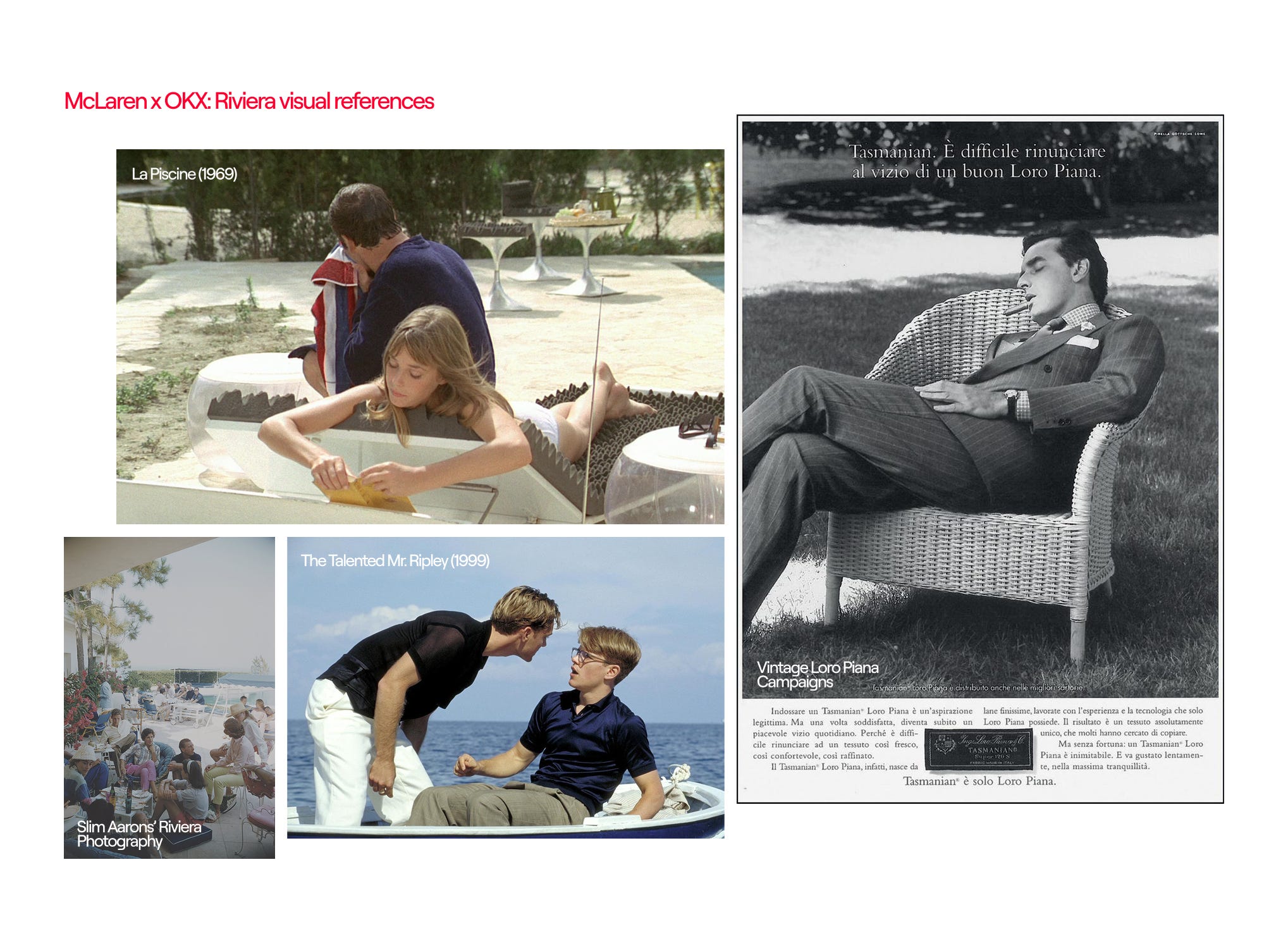
A: The campaign video has a distinct cinematic tone — were there any films, designers, or cultural references that guided your moodboard?
MW: Visually, we were influenced by La Piscine, early Slim Aarons photography, and the textures of '60s Riviera cinema. We also looked at tailoring from Edward Sexton and old Loro Piana campaigns to shape the wardrobe and colour palette. Tonally, there's also a dash of The American Friend and The Talented Mr. Ripley — stories where charm and danger live in close proximity.
A: If you had to describe the campaign's creative DNA in three words, what would they be — and why?
MW: Heritage, Precision, Myth.
Heritage — as a foundation — honouring both McLaren's racing legacy and the classic Riviera aesthetic.
Precision — for the craftsmanship behind every frame, echoing the meticulous nature of F1 design.
Myth — because the campaign lives in a heightened world where legacy becomes legend and every detail feels part of a larger story.
Let’s hope we see more of this from McLaren throughout the season — and that other teams begin to master what the Papaya team has achieved in brand building, partner integration, and long-term equity.
See you next week!
Alba

